TheMix Arabic
Balancing Handwritten and Geometrically Constructed Letterforms
The Design Concept

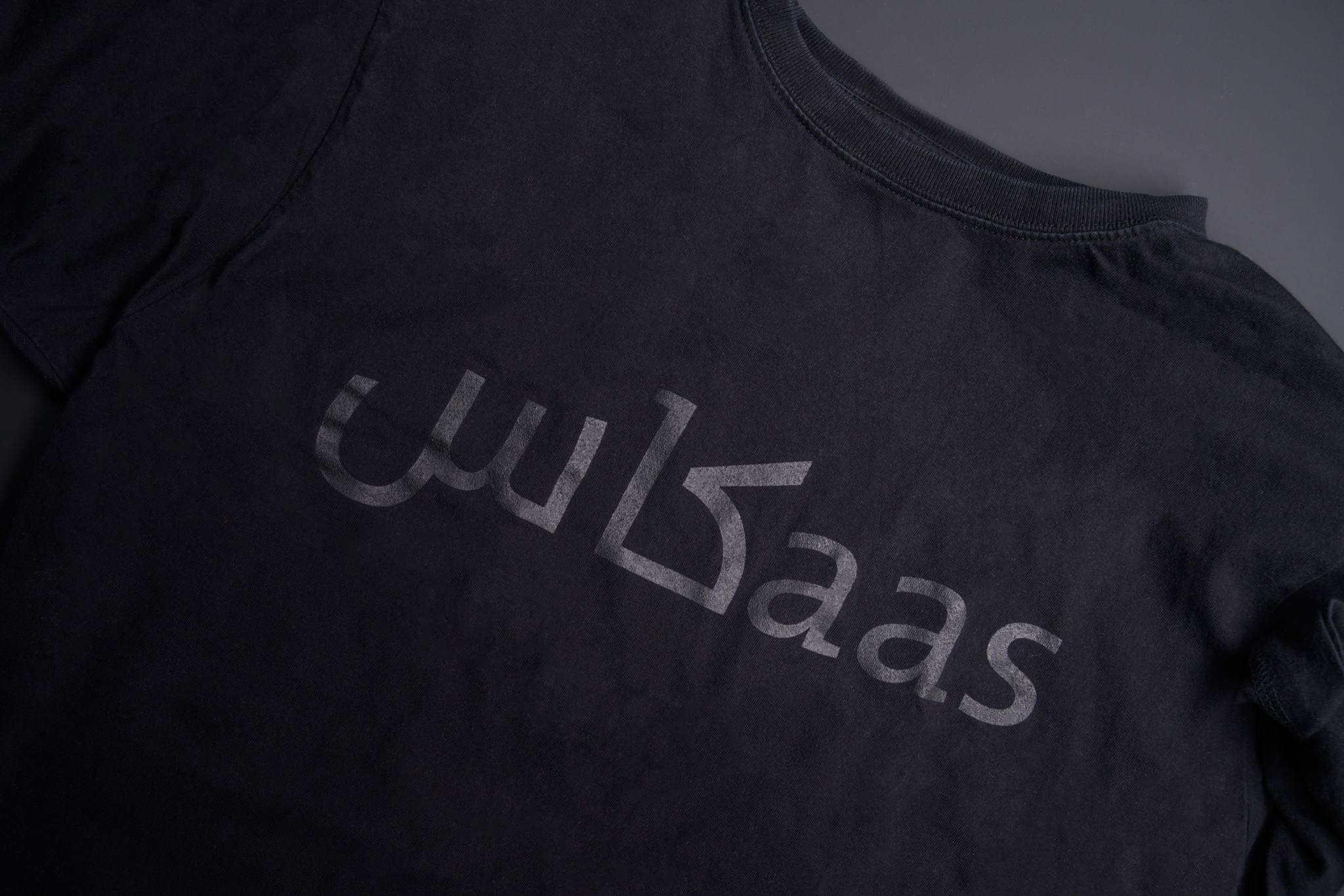
The idea of matching a western designer with an interest in mixing Latin styles with an Arab calligrapher with the same interest in mixing Arabic calligraphic styles, both proficient with lettering yet interested in more simplified contemporary design, seemed like the perfect solution at the time. This choice and team also fitted the idea of developing the Arabic version of the hybrid family member of the Thesis font family – TheMix. For me, TheMix embodied some of the subtle experimental approaches to type design (specially indicative of the typographic design trends of the 90s). I always felt that kind of approach was also necessary for Arabic type design, especially knowing how easy it would be to develop such experiments with a script that is inherently rich with variety and flexibility. TheMix was also the best font to start with since it carried serifs on some letters and not others, and it had some cursive qualities and roman/ humanist proportions and strokes, though it is almost a monolinear sans serif. Both these latter qualities made it more easily compatible with the Arabic lettering tradition. It was also the best font to start from, since it is the one that would eventually be a nice match for both the serif and sans serif fonts of the Thesis family. And so the concept of a fresh and contemporary- looking Arabic typeface was born.

The Design Process
Once the choice was set on the font to develop and the team members had been selected, the two designers were introduced and a face-to-face meeting between them was arranged. Luc(as) flew to Cairo, in November 2005, where he stayed for about five days and met and worked with Mouneer at his studio. Other than providing a good opportunity to work together, Luc(as)’s trip to Cairo was a true eye-opening experience. For the first time in his life, he came into contact with the variety of lettering in the Arab urban environment. He photographed and observed the vernacular visual culture of one of the most culturally significant Arab cities of all, Cairo. In addition, meeting Mouneer has made Luc(as) realize that there were far more Arabic lettering styles that he could use in his design than the familiar Ottoman Naskh styles that Western designers (and Dutch designers in particular) are most familiar with seeing and associating with as the “authentic Arabic.” With Mouneer’s encouragement, Luc(as)’s trip gave him the confidence to attempt this fresh approach and to create an authentic Arabic match for his Latin font. Three days of sketching and working sessions with Mouneer laid the foundations for the later work on the design of TheMix Arabic typeface.
TheMix Arabic is one of the most successful contemporary Arabic fonts. Since its release, it has been used by several cultural institutions in the Arab World, including the Sharjah Art Foundation.