Long live Koning!
Published Oct 31, 2019. Last updated Jan 24, 2020.

After years of work, we are proud to release Koning Display – the first range of the Koning typeface we are publishing. We’ll soon follow it up with Koning Text. Named after the Dutch word for “King,” Koning is the first new LucasFonts typeface in almost 20 years. Its roots stretch back to 2004. The design began as a contrast exercise inside our low-contrast Corpid family, but it quickly resulted in letterforms with their own identities. Koning remained an in-house side project we’d revisit in the brief periods when we weren’t busy satisfying corporate type-design requests. Time allowed Koning to ripen, and we applied knowledge gained from those custom projects into it.
High-contrast sans serifs are a challenging genre. Popularized by Hermann Zapf with Optima, so few of those typefaces look contemporary today. Koning transports the high-contrast sans into the present, without looking as solemn as its predecessors. Unlike most typefaces in our library, the stress in Koning’s letterforms runs vertically, rather than diagonally. The Koning Display family has ten weights ranging from UltraLight through Black, and each has an Italic.
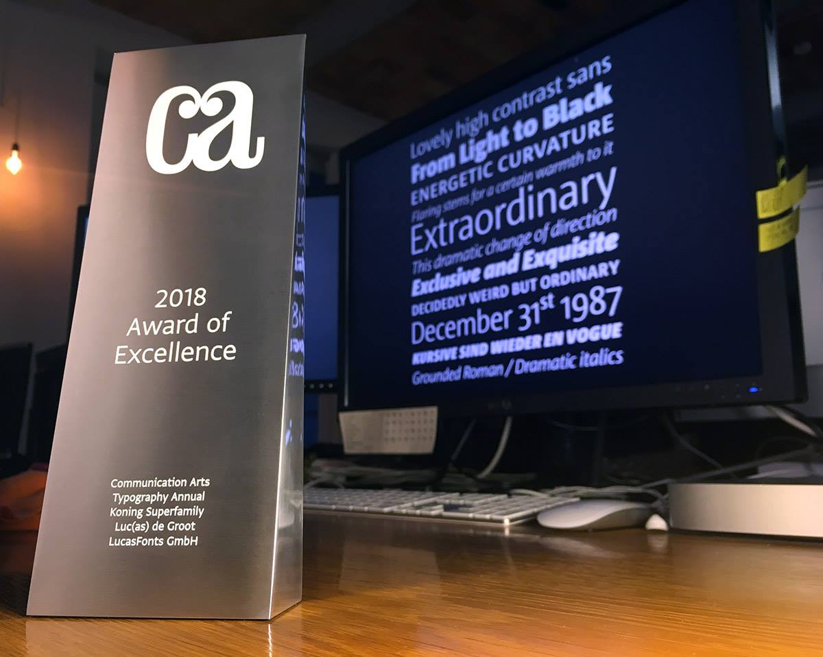
Luc(as) de Groot is the lead designer of Koning, and he was assisted over the years by Jan Fromm, Martina Flor, Philipp Neumeyer, Daria Petrova, Thom Janssen, and Ethan Cohen. Even in an unreleased state, Koning Display and Koning Text racked up several prizes. On November 22, 2019, the news went out that Koning is a recipient of a 2020 German Design Award in Gold. We are very honored! Previously, the typeface was a prize winner in the 2018 TDC² competition; it also won an award of excellence in that year’s Communication Arts Typography Annual.