Der Spiegel Futura
Category: Books + Newspapers
Designer: Der Spiegel
Year: 2018

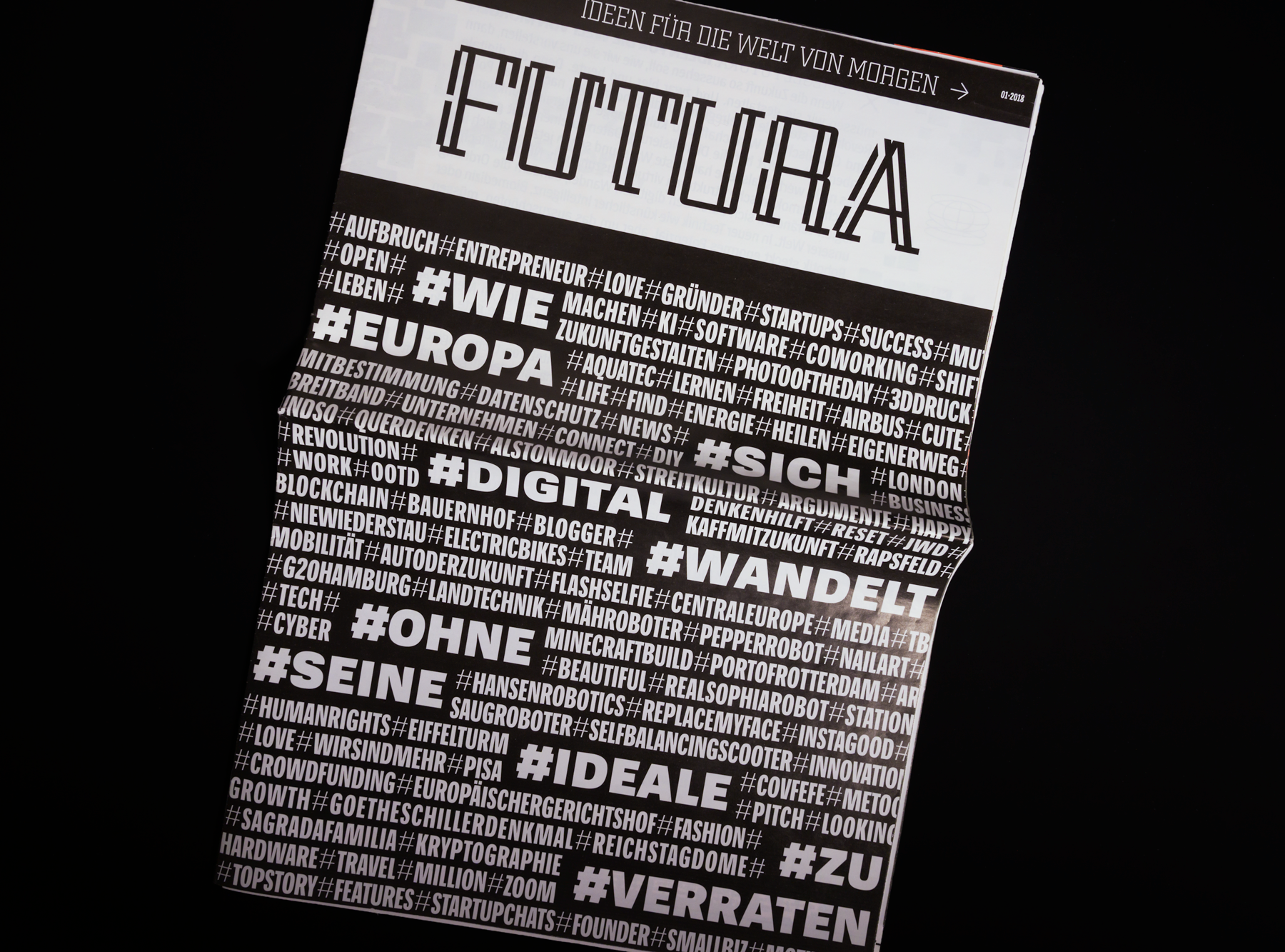
Futura was a 32-page supplement to the German news magazine, Der Spiegel. Despite its title, the supplement was not about the famous Futura typeface but instead focused on future-looking topics. After all, it was subtitled »Ideen für die Welt von Morgen«, or “Ideas for the World of Tomorrow” in English.

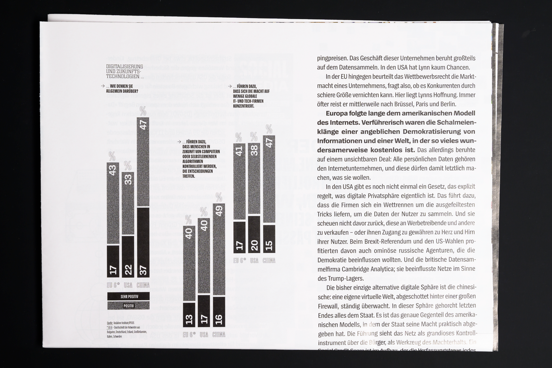
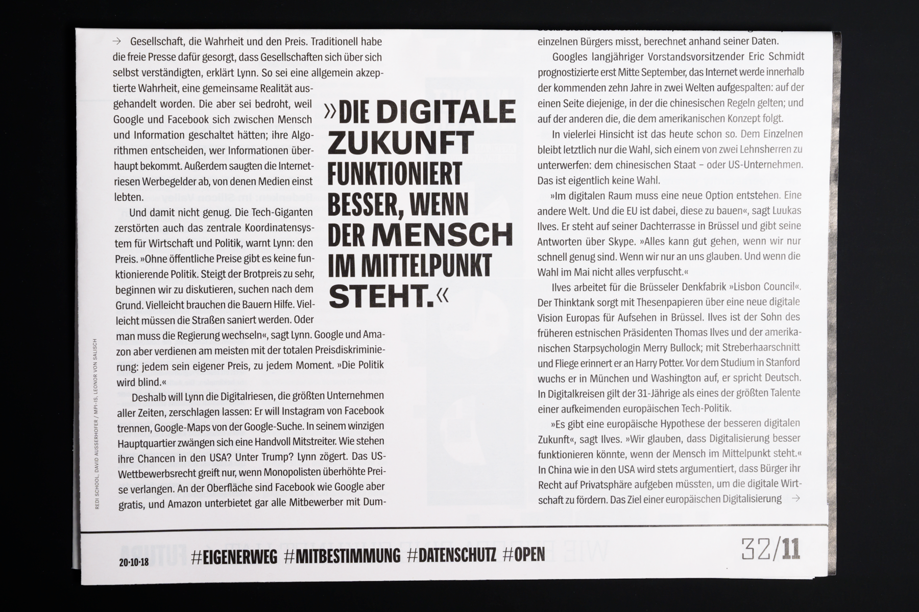
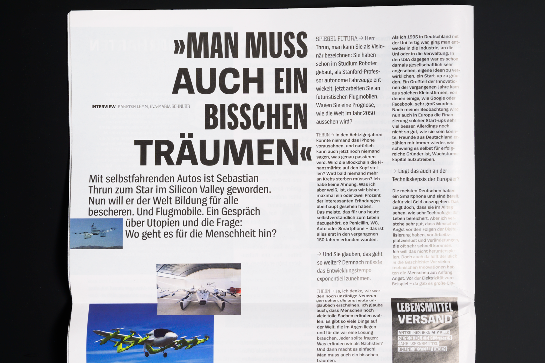
The supplement’s design language is text-heavy, and most of that text is composed in Spiegel Sans. For us, this is a great decision. We love the way the pages look! The designers even used fonts for the layout we developed especially for Der Spiegel that are not part of our retail Spiegel Sans family.

Some secondary text is in a custom font family developed for Der Spiegel called Spiegel LogoFont. Its letters are based on Der Spiegel’s iconic logo.
