Taz – Die Tageszeitung
Published Feb 12, 2019. Last updated Nov 22, 2019.
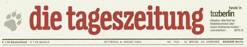
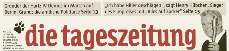
When the Berlin-based daily newspaper Die Tageszeitung (taz) came to FontFabrik in 1996 for a typographic overhaul, its look was distinctly 1970s: Futura Condensed Bold for headlines, and a nameplate set in American Typewriter. In order to provide the paper with a strong, contemporary identity while avoiding too abrupt a change, Luc(as) proposed to design a custom headline typeface with similar characteristics as the old font; the nameplate was updated.
Taz and Tazzer Text
From the outset, the Taz typeface was conceived as a double family: Taz for the headlines, Tazzer Text for introductions, captions, and short body texts. Tazzer Text is slightly wider and sturdier than Taz; also, its default a is a “flagged” a while the headline family has the one-storey a. Of course, in the more recent OpenType fonts both versions of the letter are available.
For body text, Luc(as) provided the paper with a custom version of TheAntiqua, specially adapted to the less-than-ideal quality of the printing work. Its details were simplified, its structure optimized for legibility under varying circumstances. The news face was further developed into the QuaText family.
Taz
After the exclusivity period had expired, the Taz typeface was expanded into an extensive, versatile type family for retail. The current version, Taz, comes in a staggering range of 15 weights, including a large series of distinctive hairline fonts and an UltraBlack for maximum impact on giant posters and in magazine headlines. Although the Taz family was designed as a newspaper font, it works equally well in many other contexts. It has been used in glossy magazines, sales catalogues and corporate brochures, and is appreciated for its readability when used for longer texts in medium sizes.
Photos
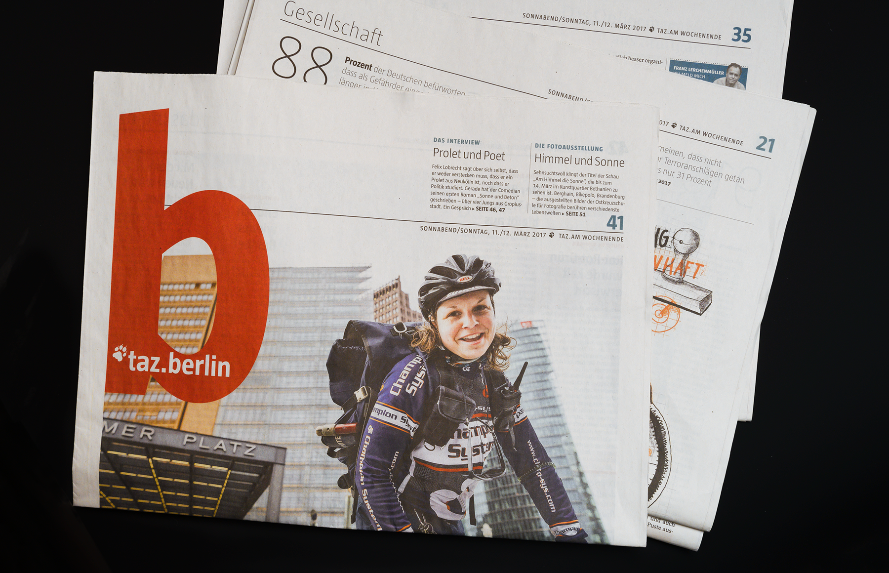
The taz.berlin section from the weekend edition of the paper, March 2017. This was a few months before the newspaper’s October 2017 redesign, which switched out the headline fonts that the layout relied on.
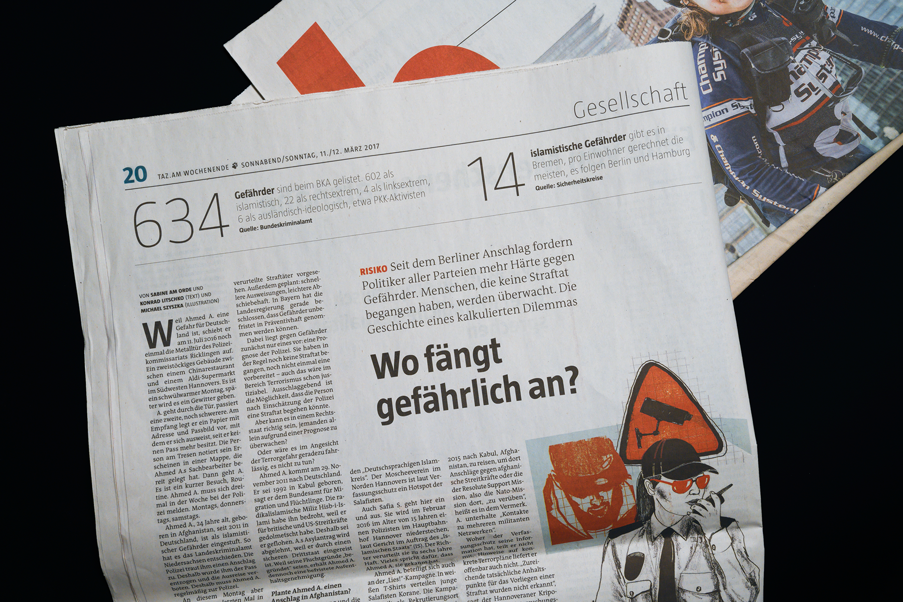
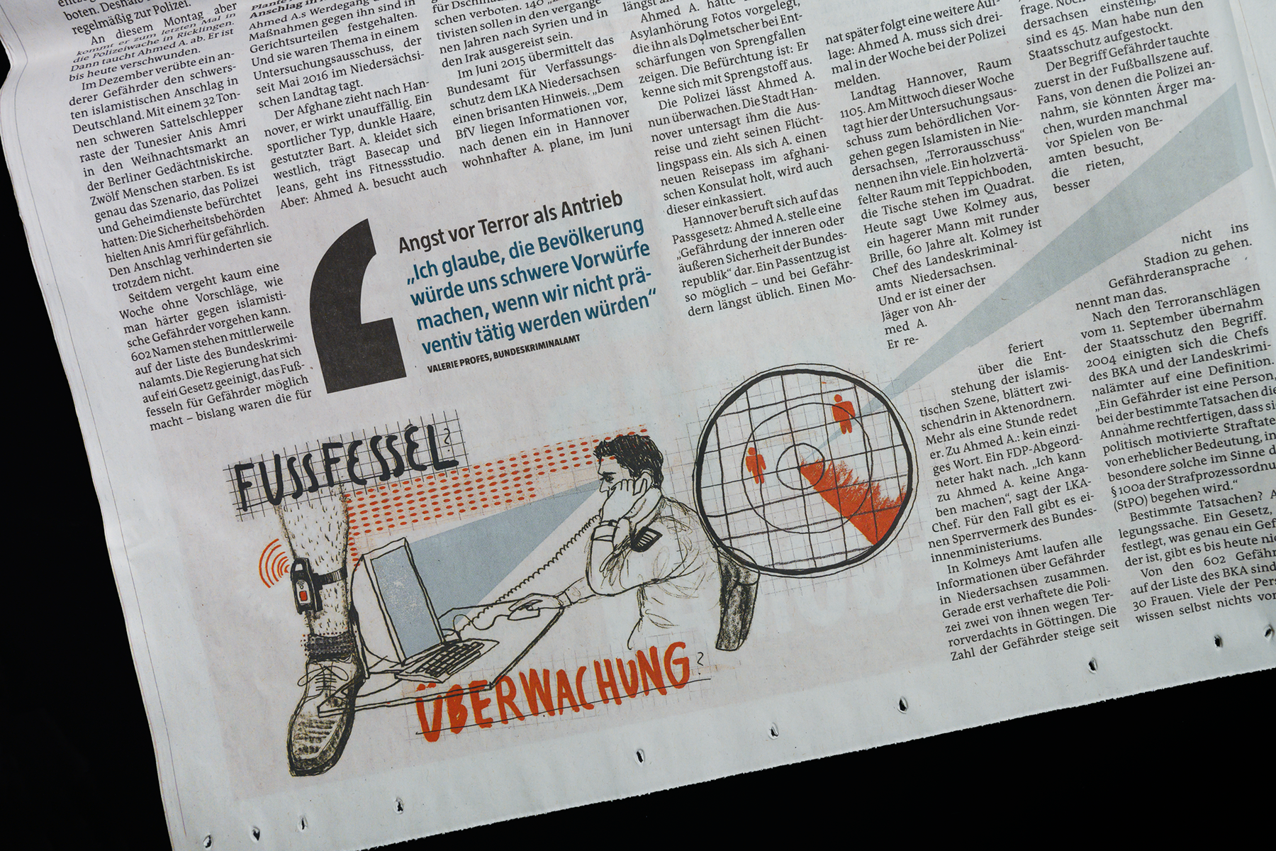
In the layout shown in the photo above, the following type styles are used (from top to bottom): Taz UltraLight, Taz Bold, TheAntiqua Light, and QuaText.