Corpid Additions for Metro
Published Feb 12, 2019. Last updated Nov 22, 2019.
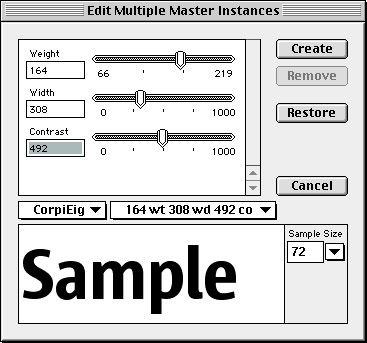
Metro is a daily newspaper distributed for free, mostly at train stations, in many different countries and multiple editions. For its basic design template, Danish art director Ole Munk chose to use the Corpid family; yet his typographic design required a version in-between the standard Bold and ExtraBold weights. Luc(as) offered to generate an intermediate version using the basic masters of the Corpid typeface. The client then decided he needed a slightly narrower version, and finally asked to produce a version with a more pronounced thick-thin contrast than is usually the case.
In order to make this possible, Luc(as) de Groot produced new basic data with three variables: width, weight and contrast. The client was provided with the Multiple Master data as well as the software technology needed to view and select the desired combination of values. Munk chose something heavier than Bold, wider than Condensed, and with added contrast, after which a variant with these characteristics was specially produced by LucasFonts. The family is now used across Europe in many local editions of Metro. To this end, it was expanded for Russian, Bulgarian and Greek.