Icons for Miele
Published Oct 15, 2021.
Miele, a leading manufacturer of household appliances, has collaborated with LucasFonts since 2003. The quality of Miele’s products has long been recognized the world over. Since the company’s founding in 1899 in Germany – owner-run until today, in 4th generation – Miele has remained true to its Immer Besser brand promise (translates to “forever better” or “better and better”). Walter Isaacson quotes Steve Jobs as saying that Miele appliances are:
… really wonderfully made and one of the few products we’ve bought over the last few years that we’re all really happy about. These guys really thought the process through. They did such a great job designing these washers and dryers. I got more thrill out of them than I have out of any piece of high tech in years.
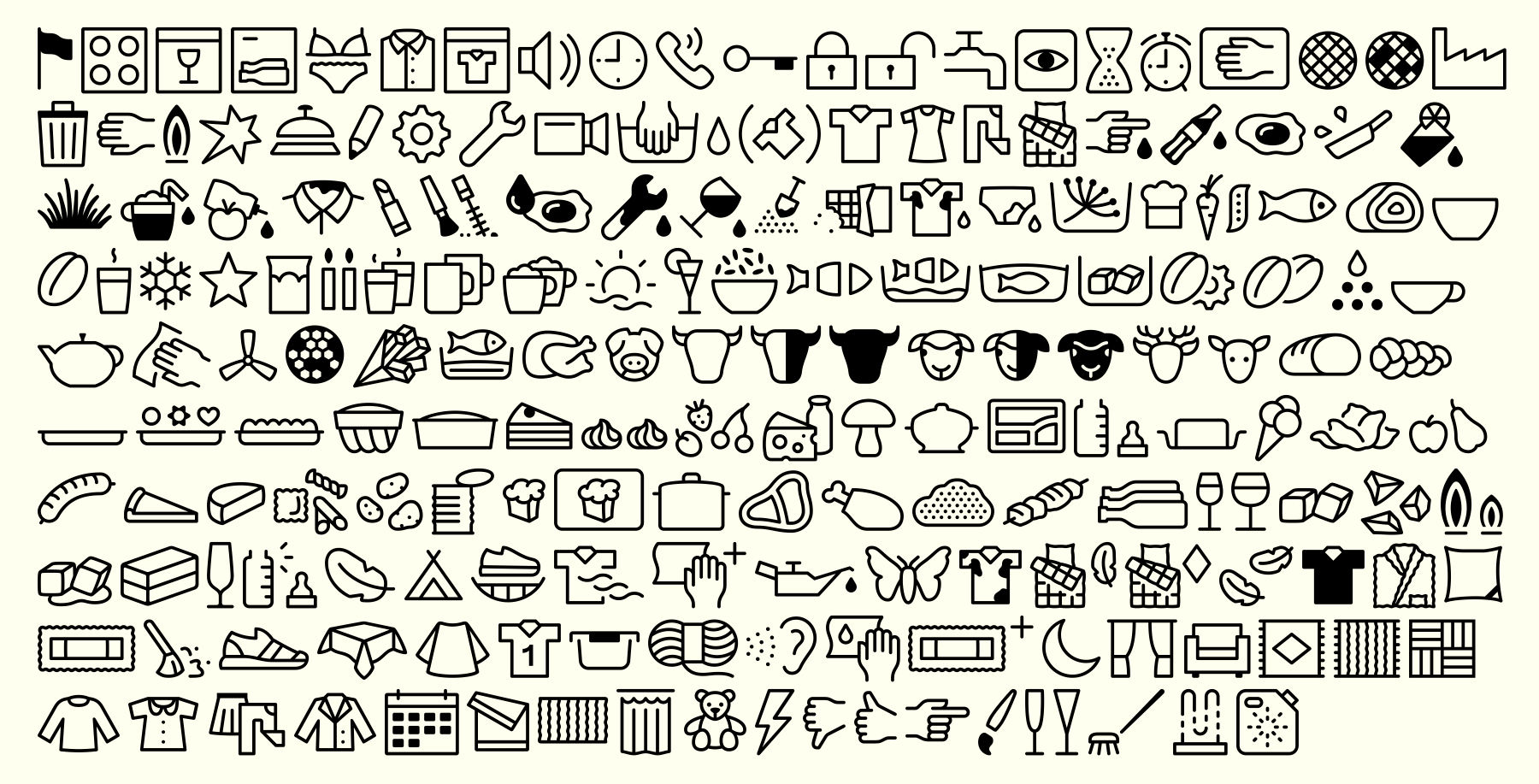
With LucasFonts’s assistance, Miele has developed a large series of user interface icons. Our role in this project sways between design execution, font engineering, and consulting on the icons’ direction. Icons that are instantly recognizable help customers and users navigate Miele’s appliances quickly and get whatever they need doing done fast. Miele’s icons share a common design language across a wide range of products, from coffee makers to ovens, from vacuum cleaners to dishwashers. The icons are legible and readable. They encapsulate Miele’s brand aesthetic within tiny spaces that are sometimes only seven pixels tall.
Miele was already embedding bitmapped icons into their machines before we became their type supplier. The icons used in the user interfaces of Miele’s appliances were saved in font files. As Miele expanded to new markets, new characters were added by Luc(as) to the tiny bitmap fonts to support more languages. Bitmap fonts in 7, 8, 9 and 10-point are generic because there is little room to play, but in bigger sizes design comes in. These were then based on Luc(as)’ adaptation of Helvetica for printing typography on machines. His Helvetica is more loosely spaced, more open, and has better curves than the official Neue Helvetica from Linotype.
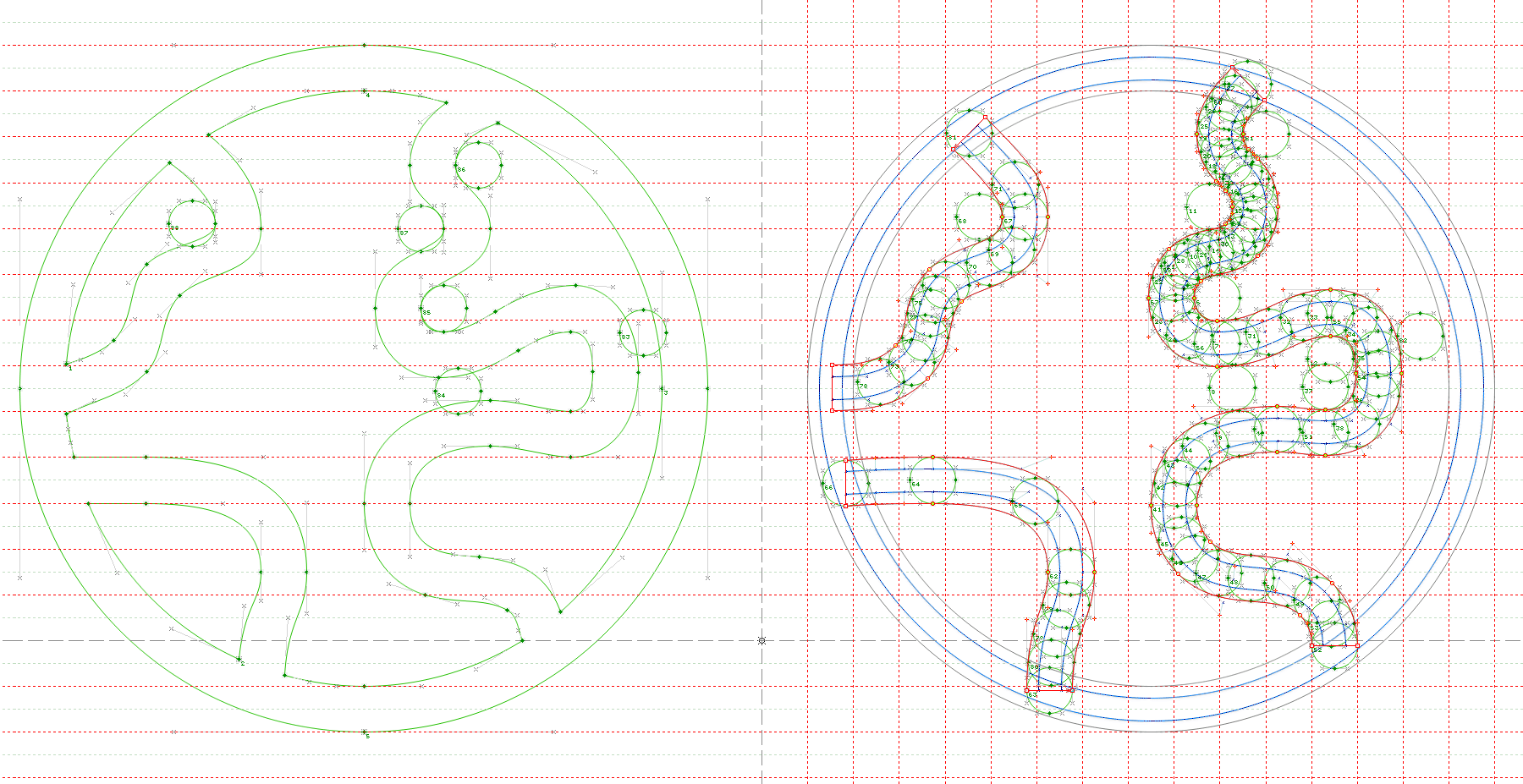
Each Miele pixel font was prepared for a specific size. The same icons existed in versions that were 12, 14, 22, 24, 26, and eventually 36 pixels high. The smallest sizes were the oldest, but larger sizes were added over time as displays improved. According to Miele’s slogan Immer Besser, which speaks to the company’s desire to always improve – Miele’s interfaces are always getting better and better, too. Eventually, the bitmapped icons were supplemented by outline fonts, whose vector drawings were synchronized with them. The level of detail had been limited in the bitmaps, due to the coarse resolution that the size-specific grids had offered. Luc(as) sometimes used hints in a TrueType version of the outline font to produce consistent bitmaps for new icons and sizes. The main reason for the longevity of the Miele bitmap fonts is that they offer up to ten years of guarantee on their washing machines.
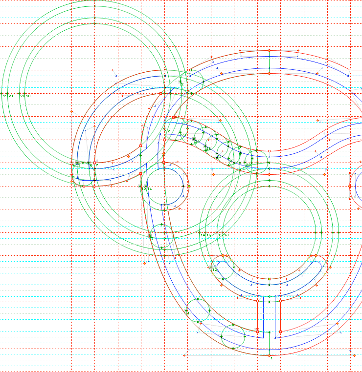
Designing bitmaps with hints is a most challenging art. The bitmapped icons’ traits were carried over into the outline fonts: each one was simple in design and monolinear in its drawing. The icons are drawn with a minimum line thickness, even white spaces inside the symbols may not be below this line thickness. Newer machines with better screens are now using outline fonts for the user interface as well. Our internal working data contains two versions of every icon: a lighter and a heavier one. Intermediate weights for special purposes are calculated when needed.
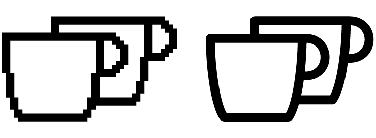
Within the bitmap fonts, several icons can be “animated”, meaning that the fonts contained one glyph for each stage of the animation. Displays could then cycle through the glyphs, showing the movement frame-by-frame to animate a coffee cup being filled, for example. We added frame-by-frame animations into the outline fonts, too.
Size-constraints are not the only kind of challenge that icon design brings. A few years ago, we worked on a series of icons depicting the different kinds of stains that clothes could have, visualizing blood, sweat, pee and poop, in black and white. We have even designed icons to differentiate between different varieties of hot drinks, for instance between cocoa and coffee.
The design process can differ, depending on project stage, obviously, and briefings; the results need consistency, nonetheless. Sometimes Miele’s design department responsible for hardware graphics sends us sketches for new icons. Then we redraw them within the technical confinements and make Light and Bold versions. Sometimes we propose revisions to a new icon’s design. At other times, we will just be provided with a list of terms that need new icons, and then we design them from scratch.
Miele’s icon fonts currently contain more than 1,500 icons. Over the course of about a decade, the number of vector icons has increased by a factor of ten. The icon font was released more than 100 times by now, and each upgrade comes with meticulous lists of changes, names and unicodes.

We are proud to collaborate with Miele on a long-term basis. With our type designers’ eyes for coherency, we support them in building up an ever-expanding icon library to support their evolving product portfolio and technical innovations. Our work for the company is an example of the fruits that grow from a long-term partnership. Thus, our work is truly sustainable, like the Miele products – in short: Immer Besser.