Slab Serif for Carlsberg
Published Oct 19, 2018. Last updated Nov 22, 2019.
Carlsberg Slab is a two-weight slab serif family developed for the Danish brewer Carlsberg, which prides itself on making “probably the best beer in the world.” The typeface was initially designed by Kontrapunkt in Copenhagen. Kontrapunkt brought us on board as collaborators, and we then expanded the fonts, adding kerning and OpenType features. We also delivered TrueType-hinted fonts to Kontrapunkt for Carlsberg to use in Office applications, in addition to PostScript-flavoured OpenType fonts for Carlsberg’s print design. Our hinted fonts help texts look better on the web, too. The project received a Red Dot Design Award in 2015.
Not only can typefaces transport a brand’s identity into text, but they also help translate an existing design across all conceivable media. Although LucasFonts isn’t a branding agency itself, we work closely with agencies like Kontrapunkt, helping them to develop branding solutions further. Taking an agency’s draft for a new typeface and engineering it into perfectly-working font files that work seamlessly in any environment is a service we’re happy to put our expertise toward.

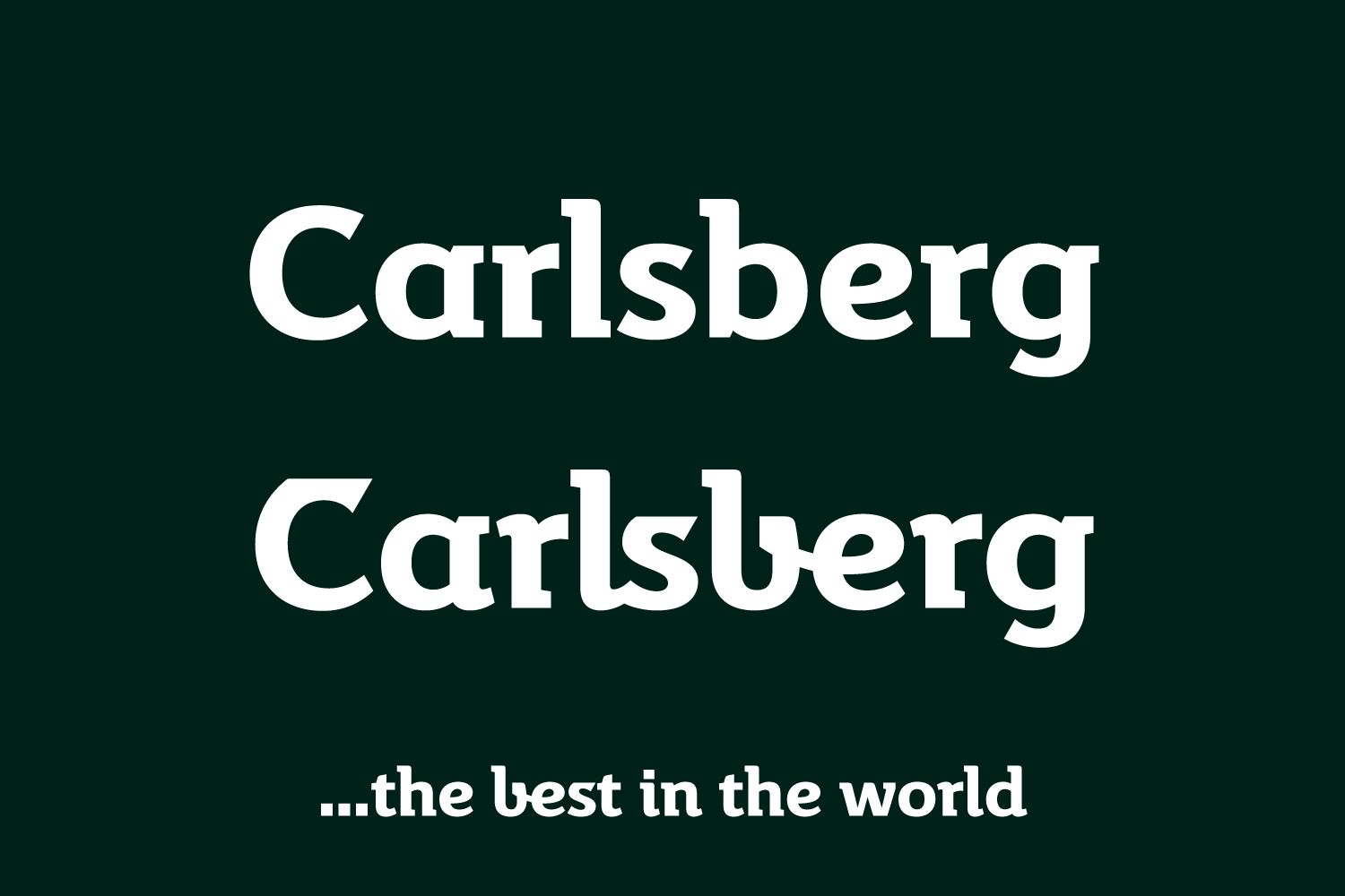
In Carlsberg Slab, letters like C and S include alternate versions with flat tops, reminiscent of the forms Carlsberg used in their logo at that time. The same is true for the alternate script-shaped b. Each font even features three different versions for the r.

Carlsberg Slab was developed to play a key role in the company’s visual communication. We’re proud to have helped strengthen the voice of the company brewing the best beer in the world today. Probably.