Interpolation and Curve Technicalities
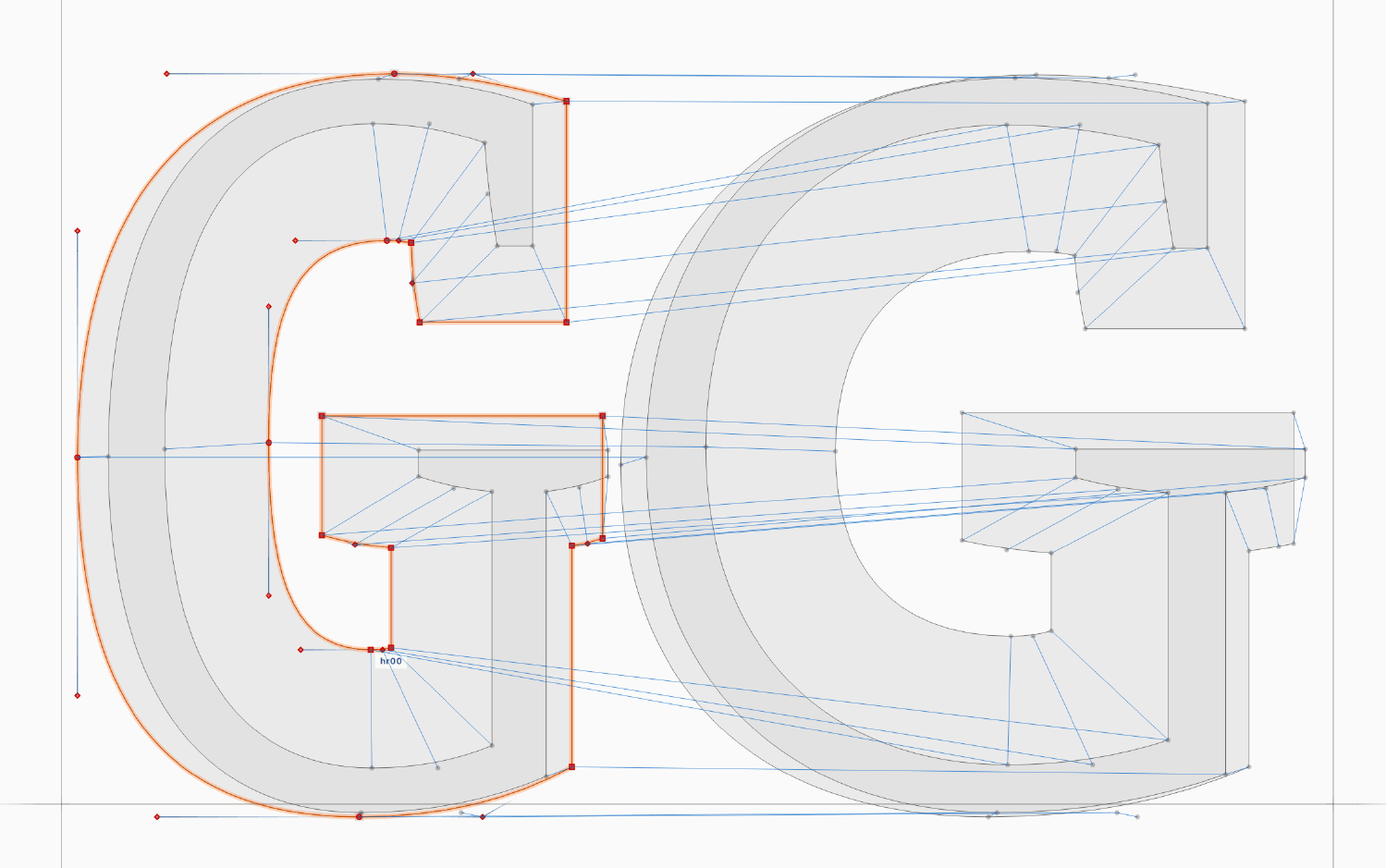
Luc(as) regrets that Font War I, as he called it – PostScript against TrueType – has led to OpenType fonts in both formats, but separate: you have to choose one or the other, and can not combine the curve types whichever are best suited for a specific segment of a letterform. He gave examples of common curve configurations that are better represented in one or the other format. For example, TrueType curves have just one off-curve point per segment, which is an advantage for very shallow curves, where PostScript curves would need to place two off-curve points on the grid in a small restricted area.1 In my opinion, as long as most type designers see TrueType conversion as an afterthought, as simple font post-processing, this will not be seen as a pressing issue.
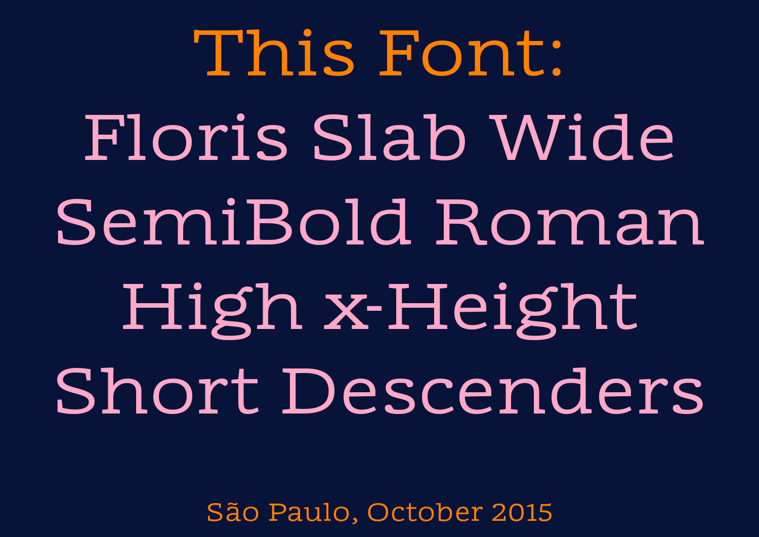
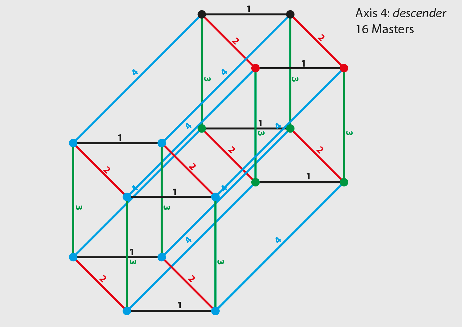
Luc(as) has been using Multiple Master technology to the extreme for all his type families. His largest project in progress is an extension of the Floris family which had 4 axes and 2⁴ = 16 masters in MM technology – the maximum number that can be used in FontLab Studio 5. Now, as a variable font, it gained more axes (the ascender/descender length axis has been split into two separate ones, and a contrast axis has been added), but fortunately OpenType Variations don’t require to double the number of masters for each new axis. Otherwise, 64 masters would have been necessary, many of which would contain identical glyphs. Now we can omit many glyphs, e.g. the descender length axis masters don’t need to store glyphs without descenders at all.
So for the LucasFonts library it is relatively easy to convert the existing fonts to the new format. Luc(as)’s team has been busy doing so over the last weeks using FontLab VI, but mainly for this presentation, because Luc(as) is not yet decided about the business model for variable fonts.
Gerry Leonidas said in his opening talk that it was hard to imagine more than three dimensions. Variable font design spaces can be built with 1 to 65535 axes, so it would be nice to find a way to help our imagination a bit. Luckily, Luc(as) has been thinking about how to visualise higher dimensions since he constructed 3-dimensional drawings with pencil and paper in school. In a happy coincidence, he recently met programmer Andrey Kuzmin, who built a browser-based font design space visualisation tool for him that currently works with up to 15 dimensions. You can find the code on GitHub, or just drag your variable fonts on the live test site fvar.unsoundscapes.com.
The next part of the talk was centered around an extension of the Calibri family. Luc(as) found a lot of Calibri on his travels where the fonts have been stretched, condensed, put on a circle – “all without variable font technology!” So the need for more Calibri styles was clearly there, and indeed Microsoft approached Luc(as) to create a “pilot for exploring the design possibilities and retrofitting issues in a variable version; no specific product plans”. This project revealed quite a few limitations of the current variable font technology.
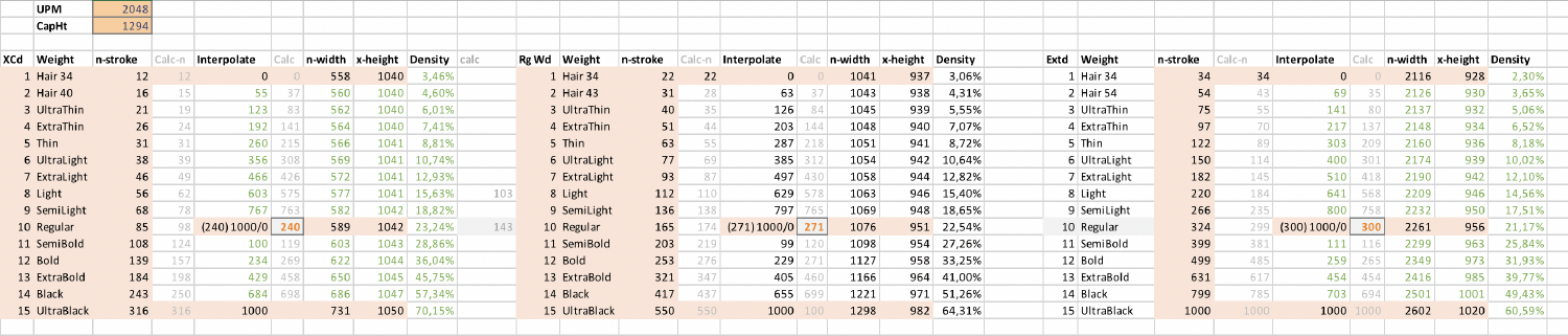
To give just one example of the limitations that Luc(as) and his team discovered: An optical size master for large font sizes should be added. The extreme thin, narrow, wide and black masters are already only usable in large sizes. But if a headline master for the regular weight and width is added, the design differences between the normal 11pt Regular and the 72pt Regular will by definition also be applied to the extreme masters in large sizes, resulting in unwanted changes. Currently the only way to prevent this is to duplicate all 8 extreme masters in the font, and then duplicate them another time, because the same issue applies to the 6pt optical size. This will bring the desired result, but the font will have a much larger file size. Of course, file size savings are one of the big selling propositions of variable fonts.
Another thing is that the Large Regular master is nothing but an interpolation of the existing variants: A little lighter and a little narrower than the 11pt Regular. So there should be no need to add this data explicitly at all. For this, a kind of virtual axis would be needed. At the time of writing, there are already discussions going on about extensions to the OpenType specification to address these issues.
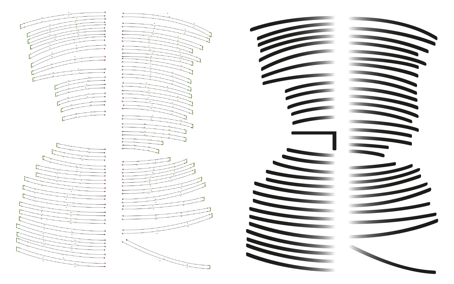
The issues around PostScript and TrueType curves surfaced again in the Calibri project. The masters were designed in PostScript outlines, then converted to TrueType, and all curves had to be tweaked manually to accommodate the extremely wide interpolation range, and are still not perfect.
As Luc(as) began to explain that pornography has been a critical factor for most successful technologies in history, Jürgen Siebert intervened to stop him, but that may just have been because Luc(as) was well beyond his allocated time slot by now. The first released variable font from LucasFonts is a reworking of his classic porno font “MoveMe MM”, which you can download for free.
You can watch the whole presentation here:
-
As Chris Lilley from the audience noted, SVG contours can actually use both curve types next to each other, but SVG in OpenType is a relatively new addition that is not widely supported and has other drawbacks, e.g. it can not be hinted, which is not a big issue for color fonts, its main intended purpose. ↩