The shape of the new 1E9E LATIN CAPITAL LETTER SHARP S
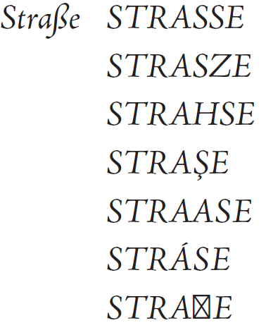
What does the lowercase German double‑s shape look like again? It exists in countless variations, let’s first find out why, before I focus on the new capital letter.

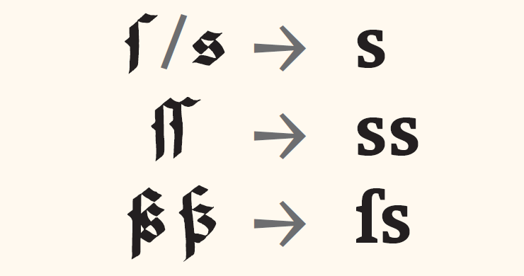
Around 500 years ago, the ligature of a long ſ and a short s was used in many Latin-script languages. Italian writing masters like Arrighi, Tagliente and Palatino used this ligature in various styles:
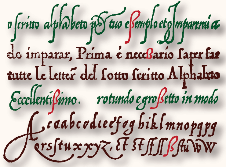
This perfectly evolved shape is found in many fonts today.

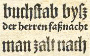
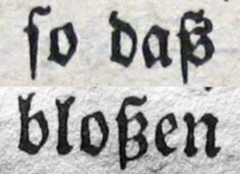
Also around 500 years ago, blackletter was fashionable, following architectural styles. In blackletter, this character often looked like a combination of a long “s” and a “z”.
About 250 years ago, the combination of a long and short “s” was abundantly used in English. German texts printed Latin-script types around 150 years ago commonly featured it, too. The ß is still used in German texts today.
Is it an SS or an SZ? (part 1)


In Holland, I was taught that the ß in blackletter is a combination of a long and a short “s”, glued together and cleaned up a bit.
The right part of the small “s” looks very much like the blackletter “z” (ʒ), so the resulting cleaned-up shape looks like a long “ſ” and a “ʒ” combined. This is where some naming confusion originated.
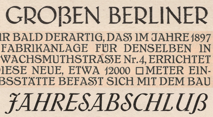
To answer the question “was it SS or SZ in typesetting?”, one should ask: “was it blackletter or Latin, was it according to the rules of Adelung or Heyse? When was it, and where was it?” The following table explains the complications, and shows once more that the ʒ-shape only appeared in blackletter:
| Blackletter typesetting (Fraktursatz) | ||
| Adelung rules Waſʒerſchloſʒ Straſʒeneinfluſʒ | Heyse rules Waſſerſchloſs Straſʒeneinfluſs | |
| Latin typesetting (Antiquasatz) | ||
| 19th century Wasserschloss Strasseneinfluss | 20th/21st century Adelung rules Wasserschloß Straßeneinfluß | 21st century Heyse rules Wasserschloss Straßeneinfluss |
Around 140 years ago, from 1879 onwards, the official rule to translate blackletter typesetting into latin typesetting (Prussia, Bavaria) was:
Is it an SS or an SZ? (part 2)
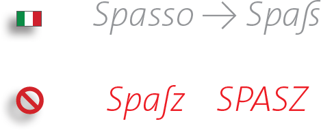
Ss or Sz? The German word for fun (Spaß, pronounced with a long vowel) comes from the Italian Spasso. It would be wrong to write it with a “z”. Anyway, historically, the name EsZett is less correct than sharp s. The glyph name for ß is “germandbls”: German double s, and the Unicode name for the capital version is Latin Capital Letter Sharp S, which is long, but very correct.

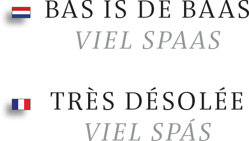
The German neighbors: in Holland a double vowel is used to make a sound longer. In France, the grave makes it short, the acute long.
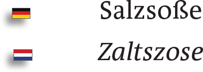
Compared with some other European languages, German is not very efficient with the s-sounds.
In German, the s is pronounced softly, like the English z, and the German z is pronounced as “ts”. The combination ss (ß) is pronounced as the English “s”. That is why it is called sharp s in Germany.
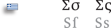
Similar to the long ſ (at the beginning and in the middle) and the short s (at the end of syllables), Greek also has two different shapes for the lowercase s, a middle and a final-s. Both lowercase variants share the same capital form.
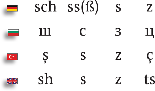
Several shapes already exist in Unicode for alternative pronunciations of S and Z:

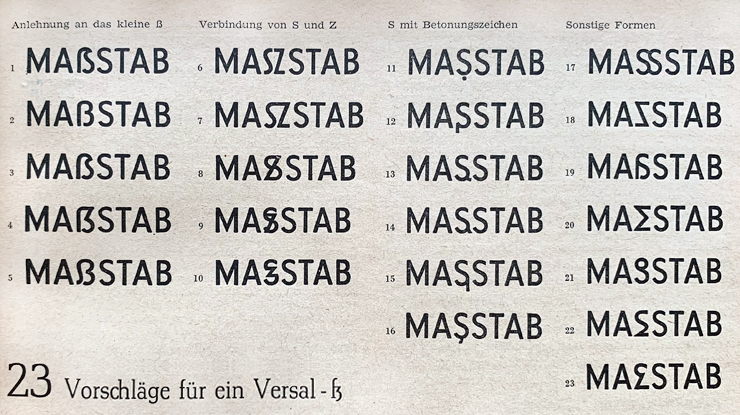
So, there would have been various alternative solutions to the German capitalization problem, but no, now we need the new glyph from the last entry in the list below, the one that is missing in most fonts:
The formal development of a capital ß
Around 100 years ago, some large German foundries already added capital versions of ß to their fonts. New fonts lead to new sales, so this might have had economic reasons as well. But it did not catch on.
Around 60 years ago, serious efforts were made to design a convincing shape for the character, and many forms we now use today were already proposed back then. But the capital ß did not catch on.
Around six years ago, a political party, fond of capitals, asked for the capital sharp S to be included.
The feedback was: “I find it very hard to read, please don’t be offended, I built my own proposal…”
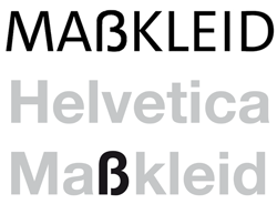
That looked just like the shape of the lowercase ß in Helvetica :-) LOL! It is not strange that a new glyph cannot be read easily at first. It has to be learned.
They accepted a version with a more rounded top, but I think my original proposal is better: the diagonal is more prominent and it has more authority. On top of that they used too-tight spacing in their campaign. No wonder they lost votes!
How wide should the capital ß be?
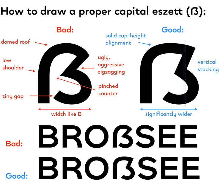
Around seven years ago, Christian Thalmann (@CatharsisFonts) made a good manual that described how to build a capital ß. A few surfers commented that his suggestion was too wide. I do not agree: wide is fine, but the counter could be pinched a bit more, to reduce the area of the big inner gap.
The new glyph combines a vertical stroke with a narrowed S/Z shape, and therefore must be visibly wider than other characters with two vertical strokes (like BDGHNPRU), but not as wide as M and W, which each have four “verticals”.
Around five years ago, Ralf Herrmann published an excellent English-language text describing how to design a capital ß. There’s a German version, too. Despite its quality, I do not think that the classification of shapes by city name is appropriate today.
Stroke endings

Analysis of classical capitals reveals that all vertical stroke endings have serifs on both sides of the stroke, and only R and J are often bare-legged exceptions. Thus, ideally the left vertical stroke should have two serifs at the bottom: one left, one right.
Constructing the glyph
By combining elements from U, Z and S, a serif version could look like this.

But that doesn’t satisfy everyone.
The missing Serif

Because of room restraints, several serif fonts have only one serif on the left side of the stem, and no serif on the right. Compared with fully serifed capitals, this looks awkward. But since the whole glyph is new and strange, this is not that tragic.
Duden rules
Duden is the German standard for language rules. Since the writing reform of 1996, the lowercase character ß is only used when the preceding vowel is to be pronounced with a long sound.
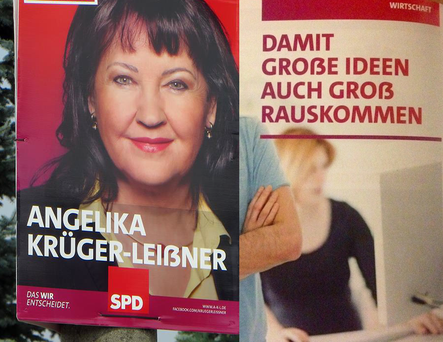
In all-caps writing, ß must be replaced with SS. An exception is made for persons’ names in official documents. In that case, the lowercase form remains.
Since June 29, 2017 (officially), a new optional capital version of the letter was added to the German alphabet: ẞ, with Unicode code-point 1E9E. It is left up to the user to decide if they want to use it instead of SS or not.
Germany, Austria, Switzerland
Even though there are many strong German dialects that I have trouble understanding, Austria and Switzerland also use the German language. Austria seems to follow German rules, and they consistently name the glyph scharfes S, or sharp s. Only in some areas of Germany it is called Eszett, inspired by the shape in blackletter typefaces. In Holland we call it ringel‑S.
In Switzerland however, since around 90 years ago, the ß glyph has been abolished altogether from the German language: they always write ss instead. Even though this might cause confusion for one or two words, in practice the intended meaning can be guessed from context. English probably has more homographs; is rock music or stone? Is a bat an animal or a wooden stick? Take the fall in the fall, drop a drop of fluid and be right to turn right where you saw the saw and left the left half. Take the lead with lead metal type, not your type?
Since the latest reform of German writing rules in 1996, the use of ß has diminished, but it is not likely that it will ever be given up completely. Plenty of Germans hate the new capital glyph, but now that it is here, we better adopt it.
Implementation in fonts
It might be tempting to put “SS” into the 1E9E slot. According to Duden rules, this is still grammatically correct. However, text set in capitals often looks better with plenty of spacing, and when you put a fixed SS into the slot, the spacing will be wrong, sooner or later.
Even though the official optional adoption of the capital ẞ happened in June 2017, it was already added to Unicode in April 2008, along with a visual example. If you don’t like the new glyph, just don’t add it.
An application is NOT supposed to force the user to use the new glyph in all-caps typesetting. InDesign has implemented it correctly. When changing the lowercase ß to small caps or ALL CAPS, the results are ss and SS. These can only be selected as a unity, but react correctly when extra spacing is added. Thank you Adobe!
Therefore it is not a good idea to add the following substitution ß > ẞ to the [case] feature. Character casing must be handled by the application, not by the font. If you implement a small-cap version of the glyph in your font, please do NOT add it to the [smcp] feature code, that would change the lowercase ß into the small-cap glyph, unless you are a dictator willing to force a non-existing directive to type users. But DO add it to the [c2sc] code, to change the capital letter to the small-cap variant.
Analysis of the 1E9E glyphs in 270 fonts/families
Page of
Above, I’ve embedded a PDF comparing the capital eszetts in 270 different designs. This selection was not made according to any particular criteria. Instead, the pages show all of the fonts containing a glyph at the Unicode position 1E9E that I could collect within a few days, back in October 2018. Most of the fonts are available as part of Adobe’s CreativeCloud subscription (on MyFonts, only around 5% of fonts contained the new glyph). The families in the PDF are sorted by shape.
New capital eszetts for my Calibri typeface
In 2003, I designed Calibri for Microsoft.

In 2010, Microsoft added a capital sharp S: not nice and definitely too narrow.

For Calibri Light in 2012, I designed and tested three versions of this character:

This is the version we chose:

Since then, Calibri has had different versions of this letter in the different weights.

The Microsoft versions have some problems. When I pointed them out, they asked me to supply new drawings, but these have to be on the same width.

I prepared five variants for Regular and Bold, and a questionnaire for Berlin Typostammtisch attendees to choose their favorite version.

Here are the voting results: the winning shape is already available in the Light weight. That this version fits well with Calibri doesn’t mean other shapes won’t fit other sans serif fonts.

That’s it!
The goal of this publication is to prevent carelessly designed future versions of this new character. Please spread the word.