TheSans

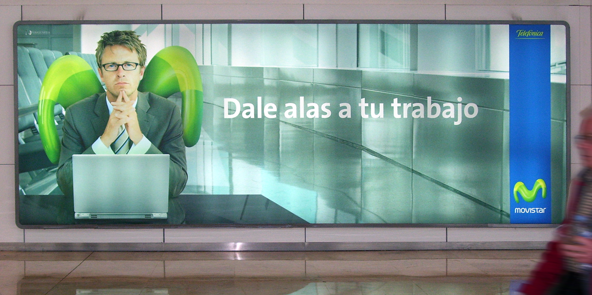
TheSans is part of the Thesis superfamily which Luc(as) de Groot first published in 1994. Over the subsequent decades, TheSans came to epitomize the useful-yet-friendly, all-purpose contemporary sans-serif. It has become the face of thousands of organisations, publications and web sites, making it one of the most widely used sans-serifs world-wide.
Thesis was conceived as a versatile typographic system of ambitious scope. It grew out of a dissatisfaction with the limited range of good typefaces available for corporate identity projects. It aims to fill that gap by providing the user with three compatible styles – TheSans, TheMix and TheSerif – in an optically harmonious range of eight weights, including real italics for each weight.
TheSans is a low-contrast typeface – i.e., the differences between thin and thick strokes are not very pronounced. Yet the reference to writing with the broad-nibbed pen is still present, giving the letters a diagonal stress and a forward flow that facilitates reading. The roman letterforms tend to have some characteristics of an italic or written construction. Yet the italic forms themselves are very distinctive: they were not derived from the upright but were individually designed while perfectly complementing the roman forms.
Version history
FontFont published FF TheSans in 1994. In 1999, Luc(as) began selling licenses himself, renaming it TheSans (classic). The fonts had Proportional Oldstyle figures, but TheSans Basic was created to offer Proportional Lining figures. We also used to sell TheSans Caps, with small caps instead of lowercase. These fonts supported Western European languages only. OpenType allowed us to include more characters, and we created a system for package naming. Here’s a description.
TheSans Office
This four-font family has the structure that’s conventional on Windows: Regular, Italic, Bold, Bold Italic. These are linked, meaning they can be accessed through the “B” (Bold) and “I” (Italic) buttons in office programs. The TrueType versions are manually hinted, giving them excellent reading quality on-screen in Microsoft’s Windows applications.
TheSans in corporate design