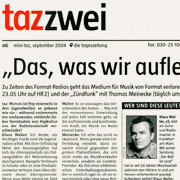
Taz
The Taz type family was originally designed for taz (short for Die Tageszeitung), a nationwide German daily. The first task was to design the all-important headline typeface. The briefing was to develop a strong, trustbuilding visual identity, and to get away from the 1970s design that no one had ever managed to change. The colour of the new headline face had to be similar to its predecessor, Futura Bold Condensed, so that the new visual language of the paper would not come as too much of a shock. Says Luc(as): “For a headline font, you want the lines to be as closely linespaced as possible. The accents on the capitals – a very common feature in German – cannot take up too much space.” Ascenders and descenders were kept short for maximum impact.
Besides the Taz headline face, TazzerText was designed for sans serif body copy. TazzerText is a wider cut. The italic fonts use a broken construction instead of cursive, because of the need for a clear, sharp message inherent in news. A true italic has characteristics of handwriting, which we thought were unsuitable for this newspaper.
In presenting to the clients, we put our font in competition to several other pre-existing fonts, and then let them decide which one they preferred. Fortunately, they chose LucasFonts! When the chance came to propose a new face for the text columns, we went through the same process again. The typeface that was finally chosen was our specially made news version of TheAntiqua.
Since its inception, the Taz typeface has steadily been expanded. The current version comes in a staggering range of 15 weights, including an large series of distinctive hairline fonts and an UltraBlack for maximum impact on giant posters and in magazine headlines. It includes character sets for dozens of languages including those from Central Europe and the Baltic states, as well as Icelandic and Turkish. Although the two-storey “a” is now the default, Taz includes an alternate one-storey “a” as an OpenType feature.

Taz and the press