New Fonts for Jungle World
When the in-house design team of the German political weekly Jungle World was preparing a drastic redesign in the late 1990s, Luc(as) de Groot was called in as a typographic consultant. He provided the hand-painted nameplate and a special version of his Sun typeface for headlines. For body text he proposed a rather subversive solution, befitting the paper’s own editorial attitude. The columns were to be set in two very different fonts, Plantin and Minion, slightly adapted by Luc(as) to be similar in colour; these text fonts were to be alternated every other paragraph. The designers used the principle more or less consistently for many years, and nobody ever complained.
Floris JW
The newspaper’s design was completely overhauled in 2007, and Luc(as) played a major role. He drew Floris JW, a new, seven-weight headline version of the Floris typeface, which had originally been developed for the French daily Le Monde. Additionally, a completely new Floris News family was specially designed for use on Jungle World’s coarse newspaper stock. The articles’ texts are composed from those fonts.
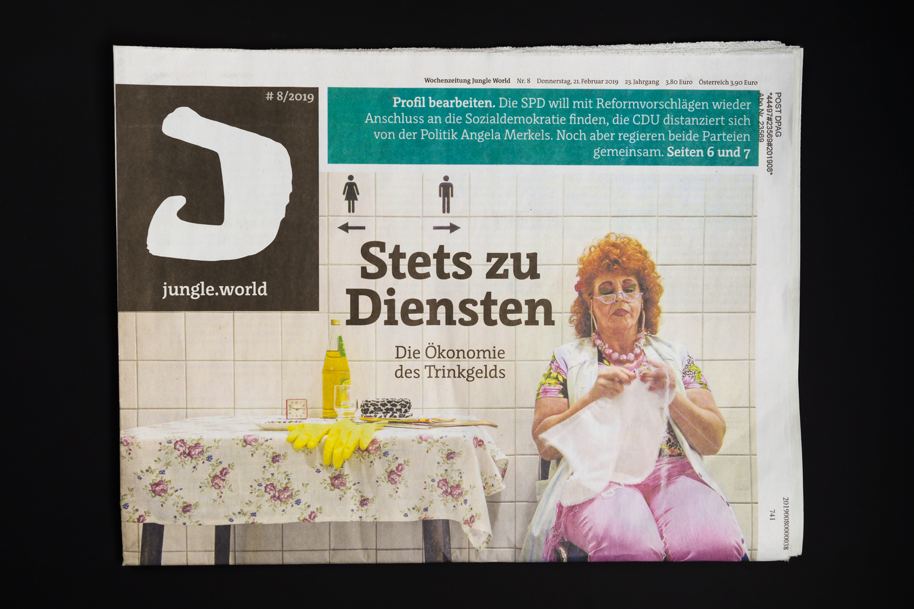
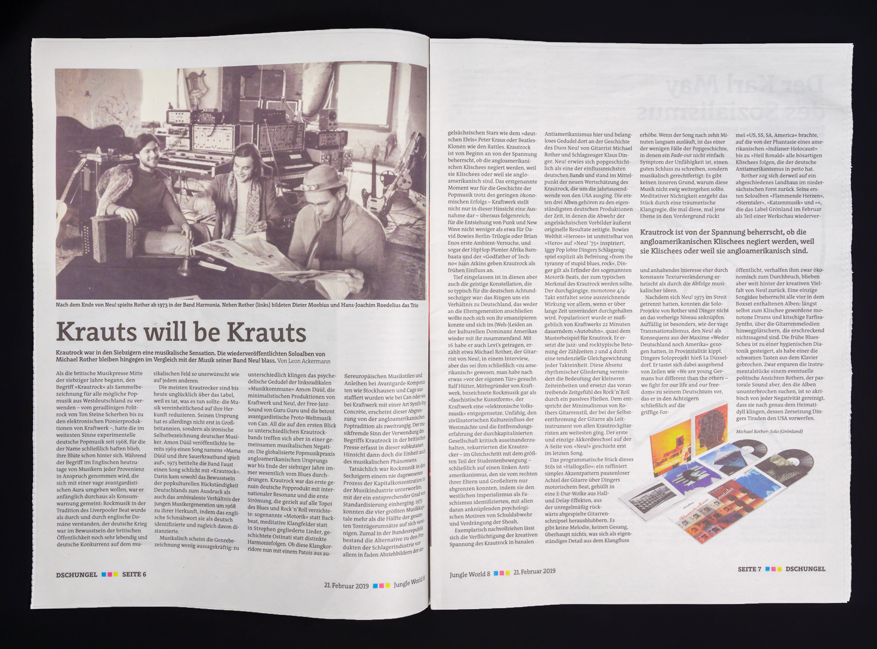
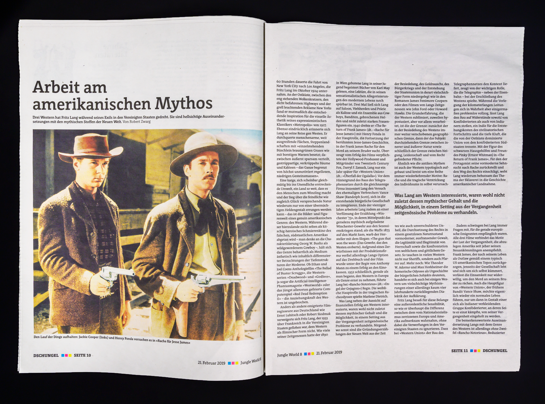
In 2016, the newspaper was redesigned again. Above the fold, the editorial design put in place calls for a large photograph to illustrate the title story. The headline over top of this – and the rest of the headlines – are still composed with Floris. The articles’ texts are also still composed with Floris, as you can see below. Instead of featuring Luc(as)’s original handwritten Jungle World logo, the newspaper’s nameplate uses his J in the top-left corner.
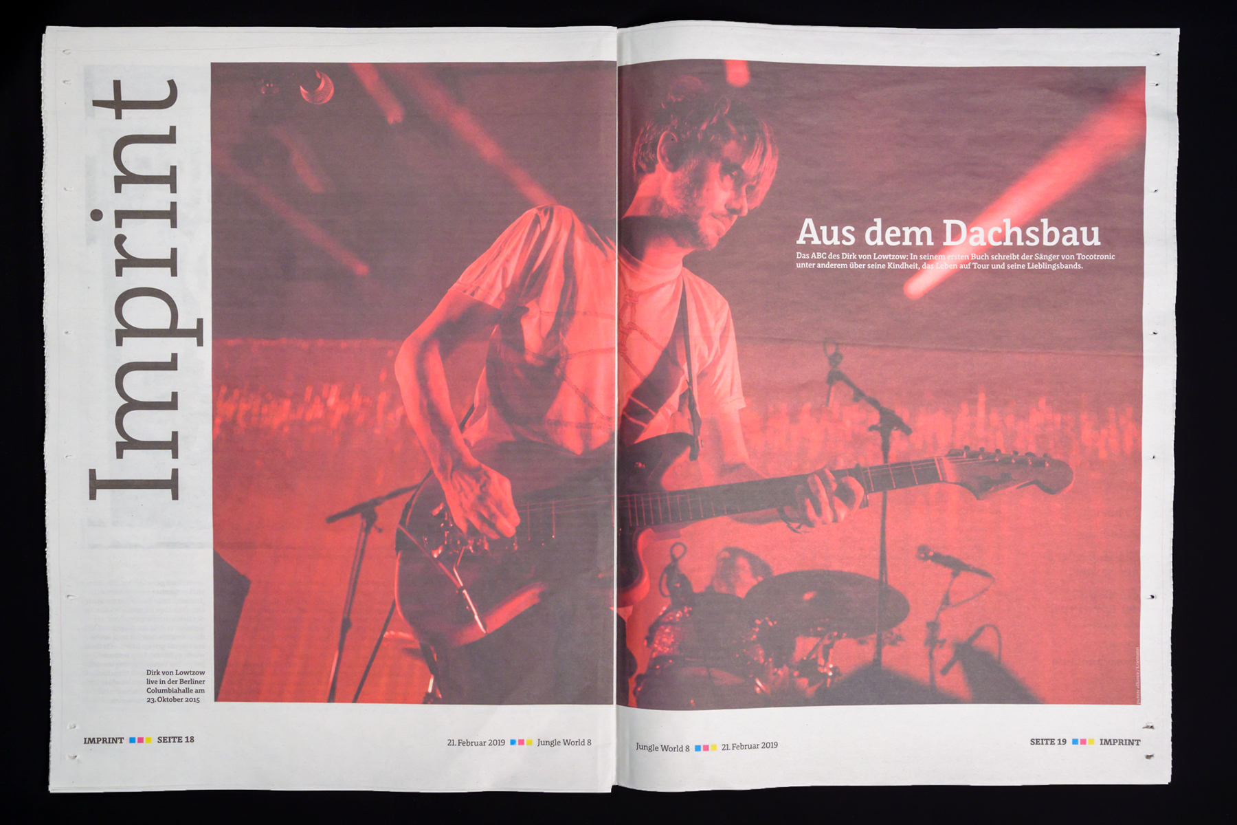
The close-up photograph below highlights Floris as it has been used in the newspaper since 2016.
Multiple-axis data
The development of Floris JW illustrates how a broad spectrum of possible solutions can be developed from existing font data. Floris was designed in FontLab Studio using four axes of parameters, each of which can be varied to obtain the perfect typeface for a specific job. In Floris, these axes are weight, width, x‑height, and a more subjective variable which Luc(as) calls time axis and which defines the proportion of extenders and x‑height:
In the 1920s, the relative x‑height was at its smallest, in the 1970s at its largest. For a pocket bible, the x‑height should be large, for a poem a small x‑height is more appropriate.