Calibri
In 2002, Microsoft® put together a virtual team of type designers and consultants to develop the ClearType® Font Collection, a series of multi-language system typefaces to make full use of the superior rendering qualities of ClearType. This technology, “a very neat trick to increase the resolution of screen hardware using software alone”, was originally developed for e‑books by Microsoft’s Bert Keely and Bill Hill.
The ClearType Font Collection was presented to the public in 2004 and became the typographic core of the Windows® Vista operating system and the MS Office suite. Besides Luc(as) de Groot, the type designers invited included John Hudson, Jeremy Tankard, Gary Munch and Jelle Bosma. Gerry Leonidas was an adviser for Greek and Maxim Zhukov for Cyrillic.
Big and bigger
Work on the individual designs began in late 2002. In January 2003, the in-house coordinators and independent designers met at Microsoft’s headquarters. All six Western typefaces in the collection were to be developed simultaneously in three scripts (Latin, Greek and Cyrillic) with the same robust glyph set for all.
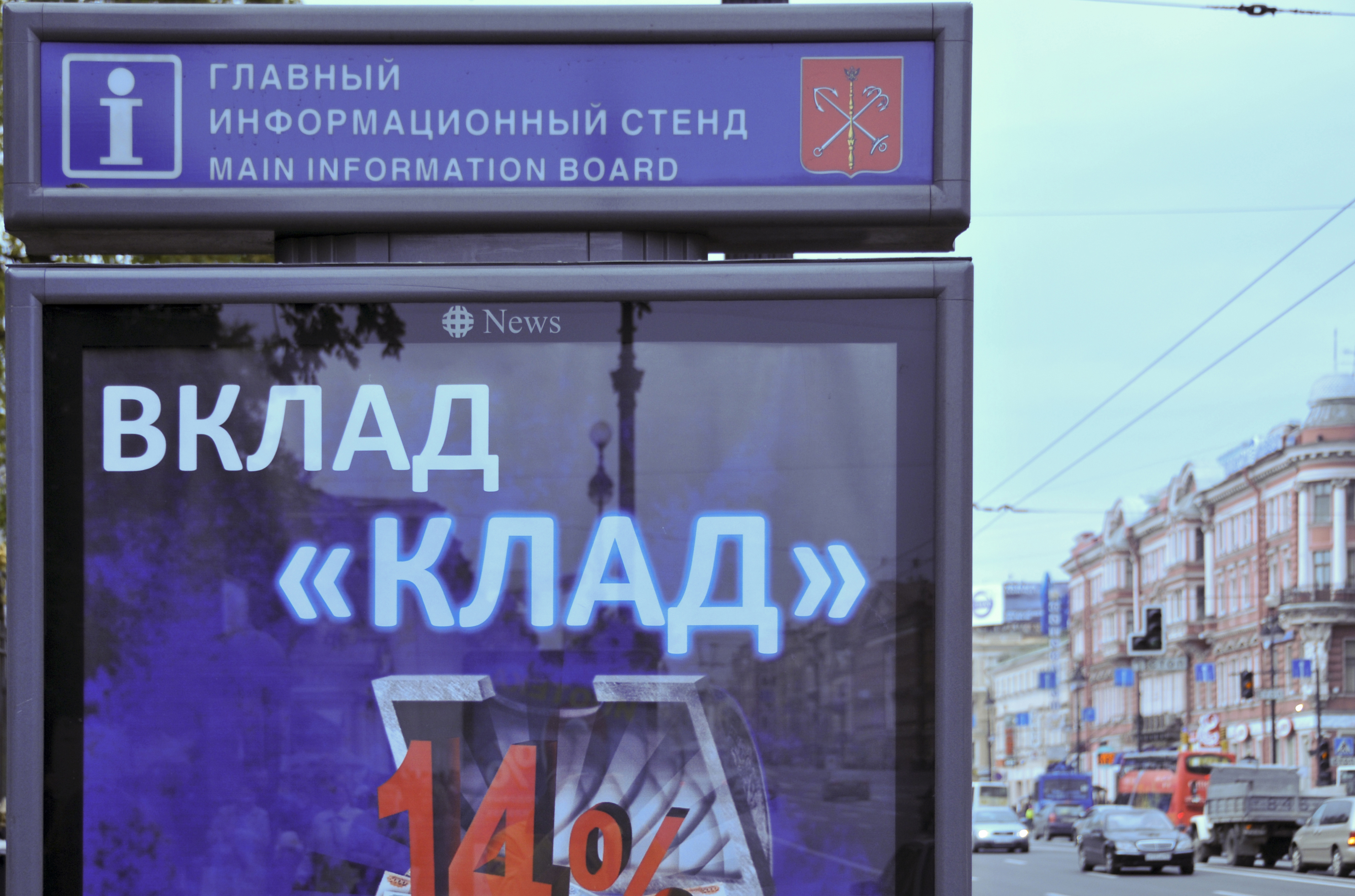
The poster text reading ВКЛАД «КЛАД» is set with Calibri’s Cyrillic letters.
As the typefaces were intended for text setting, not as display faces, most of them included fewer stylistic alternates and special features than a sophisticated display or script face might. The exception is Luc(as) de Groot’s Calibri, which is suited for both text and display settings and is exuberant with variants and logotypes and extra characters such as a suite of directional arrows.
After work on Consolas – a monospace family Luc(as) had begun to develop – had started, he was asked to also supply a proposal for a sans serif. Starting from some sketches he had once made with TV broadcasting in mind, De Groot drew a contemporary sans serif family with subtle roundings on stems and corners. However, as the roundings seemed to suffer under ClearType rendering, De Groot redesigned the font, taking out the rounded corners. When submitting the proposal to Microsoft, he sent along a sample of the original version, adding: “I like the look of it, but as you see these rounded tops look really ugly in ClearType; don’t choose this.” De Groot had in fact been critical of the ClearType rasterizer when he first saw it demonstrated.
To his astonishment, Microsoft chose the rounded version. “As I soon found out, the rasterizer had indeed improved, and rounded tops and bottoms could be rendered smoothly now.”

Calibri’s proportions allow high impact in tightly set lines of big and small text alike. Calibri’s many curves and the new rasterizer team up in bigger sizes to reveal a warm and soft character. Calibri turned out to be one of the most flexible font families of the new Collection. It was selected to be the default font in Microsoft Office® applications such as Word and PowerPoint®. As the de facto replacement of Times New Roman in these programs, it is quickly turning into one of the most used fonts on the planet.